As a designer working with Microsoft and its global network of partners, I was responsible for creating marketing collaterals and LinkedIn creatives that communicated complex B2B solutions in a visually consistent, clear, and brand-aligned manner.
Each deliverable had to sit at the intersection of multiple brand systems—Microsoft’s global design language and each partner’s unique identity. This required more than just visual styling; it demanded strategic thinking, deep familiarity with brand guidelines, and an eye for subtle coherence.
Designing within one brand system is already a craft. But in this project, I had to align two or more brands in every design:
Microsoft’s core brand guidelines (typography, grid, color, tone of voice)
Each partner’s individual visual identity
Specific campaign objectives for different verticals (cloud, AI, hybrid work, digital transformation)
Brand Fidelity: Every design had to adhere to Microsoft's Fluent Design System while simultaneously respecting partner-specific color schemes, fonts (if permitted), and tone.
Visual Balance: Ensure no brand overshadowed the other. Each design needed to feel truly co-branded.
Platform-Specific Constraints: Especially for LinkedIn, the designs had to be scannable, responsive, and engaging within a noisy feed.
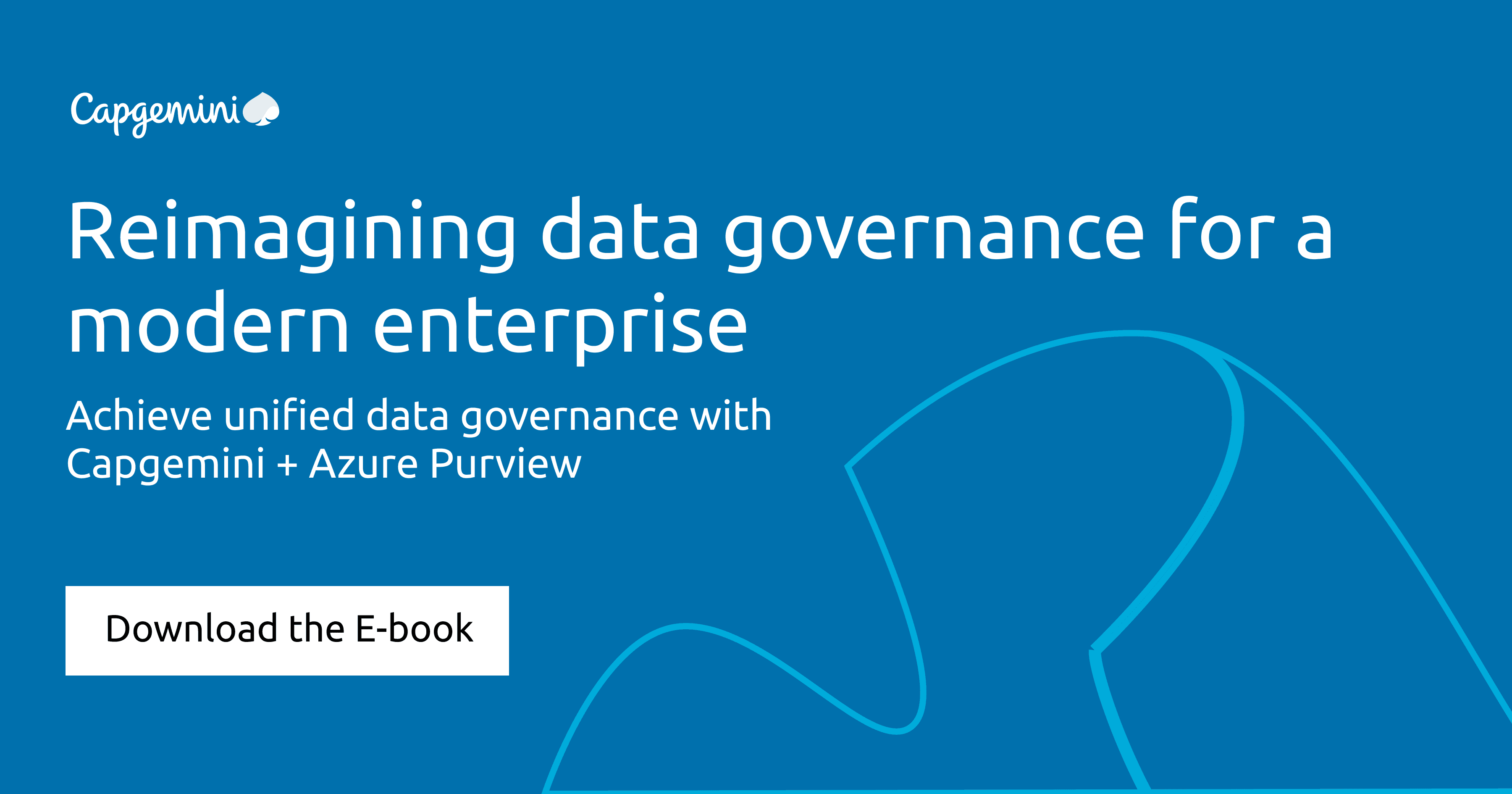
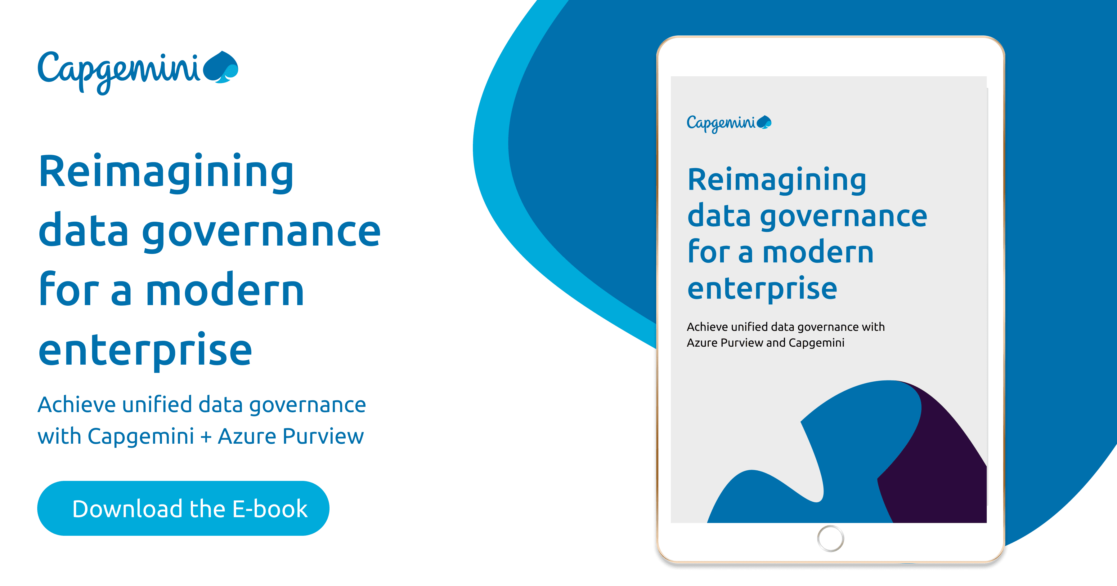
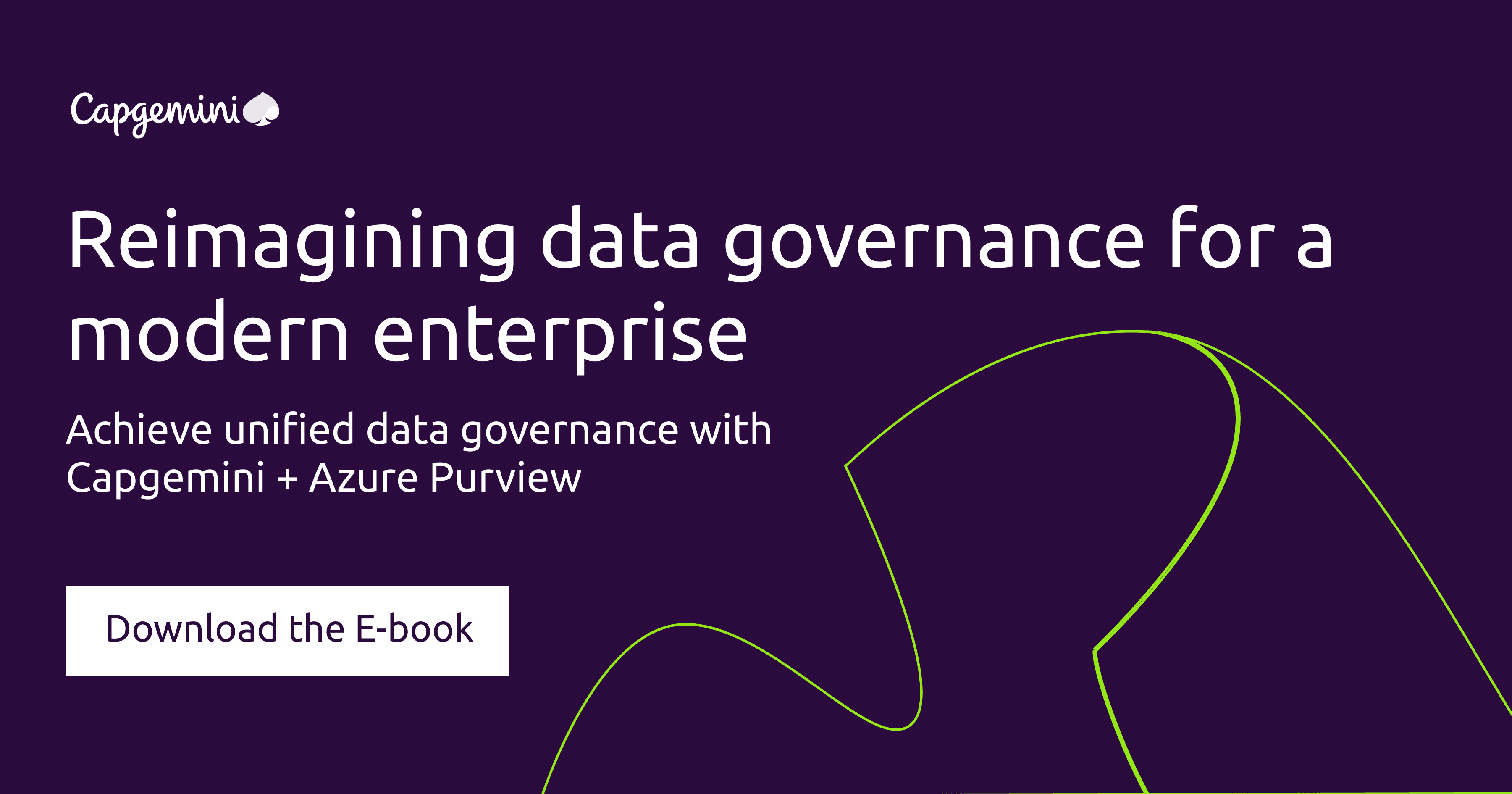
Focus: Promoting cloud adoption frameworks and Azure enablement programs.
Design Decisions:
Applied Azure’s grid structure and icon sets provided in Microsoft’s toolkit.
Used 3Cloud’s geometric visuals and bold headlines to reflect their modern, engineering-forward brand.
Converted technical architecture diagrams into stylized, simplified visual metaphors using iconography that stayed true to both brands.
Deep Dive: Sometimes, sticking strictly to the grid and padding values in the brand guide made even the most complex message feel polished and professional.


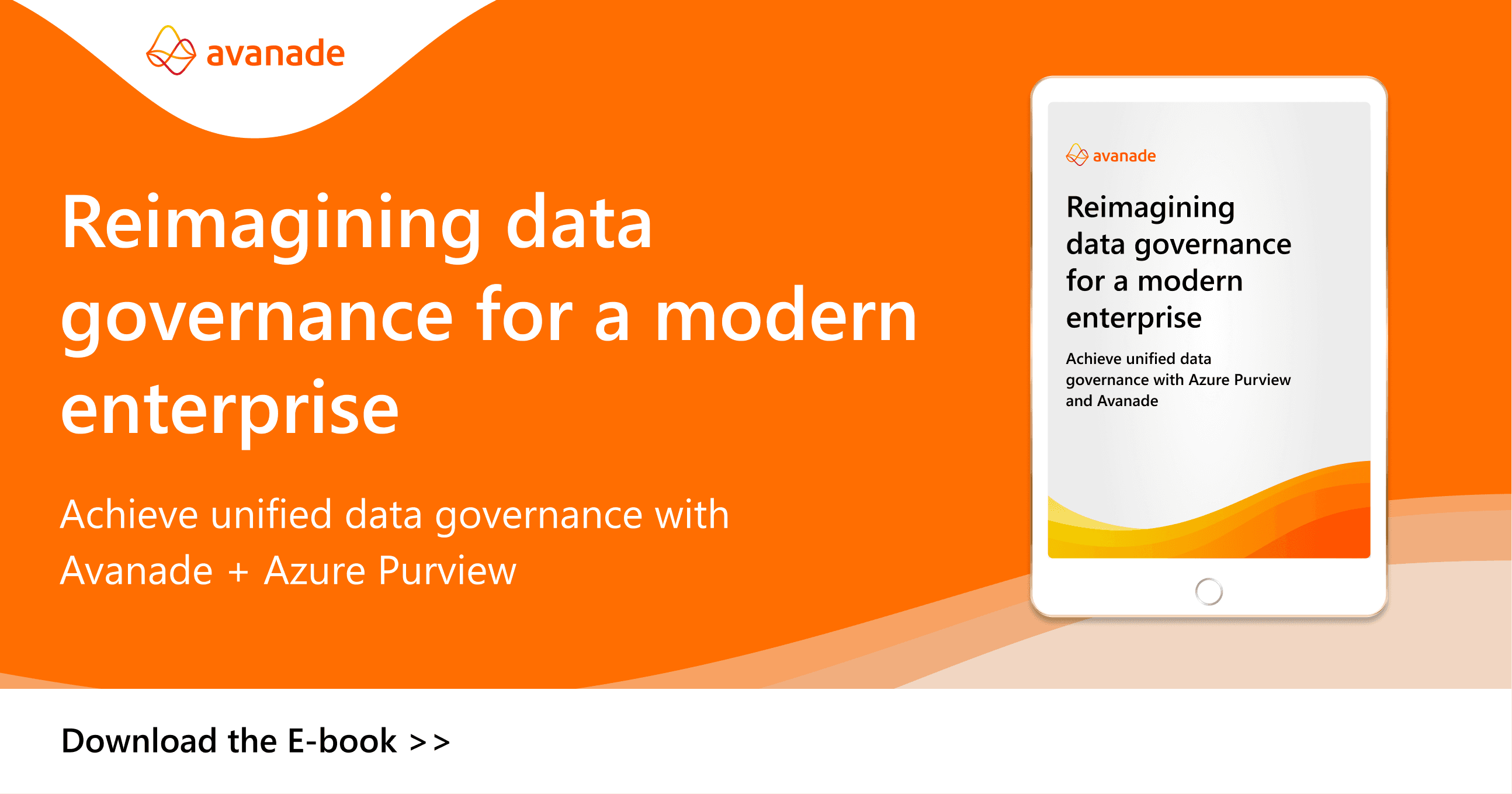
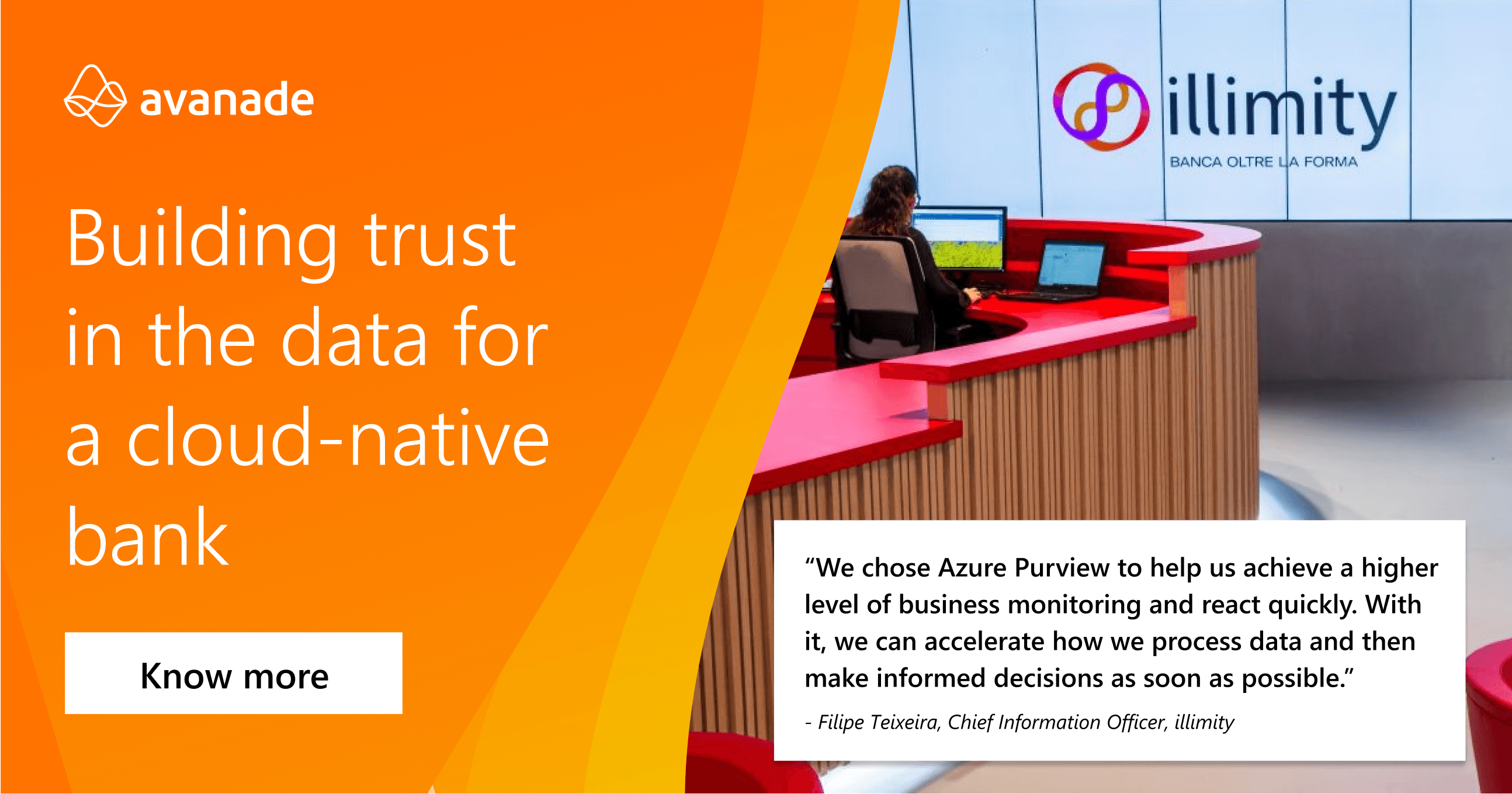
Focus: Workplace modernization, AI, and business consulting services.
Design Decisions:
Avanade’s branding leans warm, bold, and confident—so I used their vibrant orange sparingly but effectively, typically as a call-to-action highlight or content divider.
Ensured consistency in typography by strictly following Microsoft’s recommended type pairings while adjusting line-height to suit Avanade’s more dynamic layout system.
Created internal templates for webinar promos, solution sheets, and LinkedIn carousels that could be reused by their content teams.
Deep Dive: Avanade has a robust internal brand portal with detailed do’s and don’ts. I used their “co-branding checklist” to ensure my designs passed both Avanade and Microsoft internal reviews.

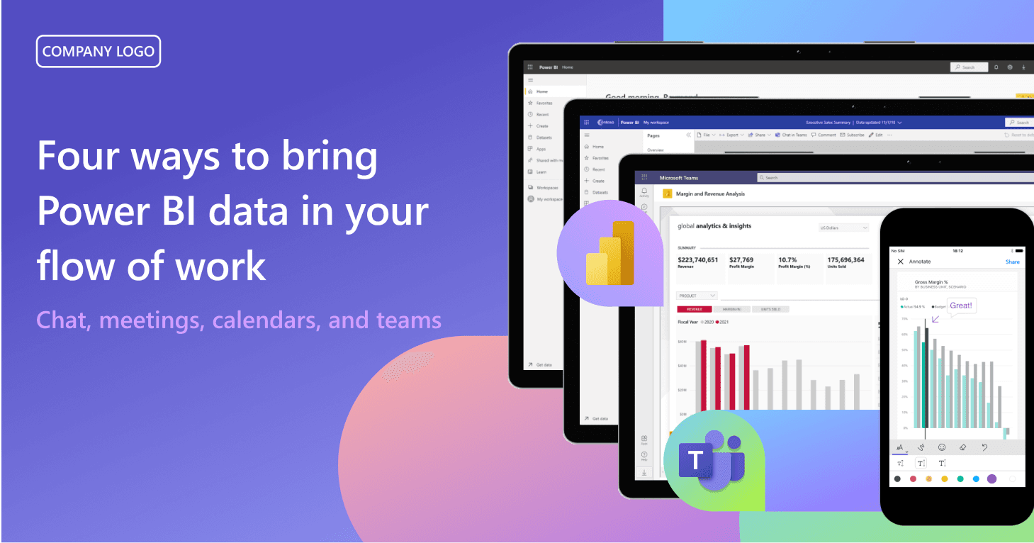
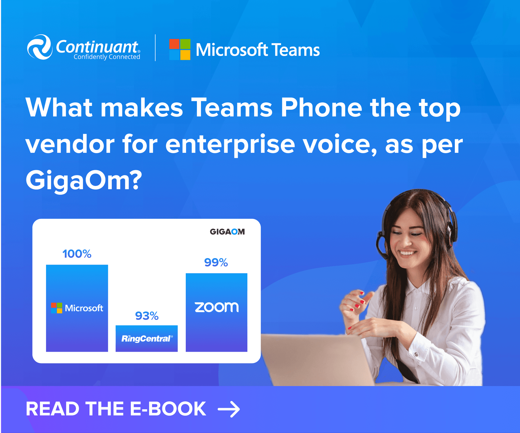
Focus: Unified communications, managed services, and Microsoft Teams integrations for enterprise clients.
Design Decisions:
Continuant’s visual identity is grounded in clarity and reliability, so I focused on clean layouts with a strong visual hierarchy to highlight their IT support and service expertise.
Incorporated Continuant’s signature deep navy and gray tones as the base, pairing them with Microsoft’s accent colors to create a harmonious palette.
For Microsoft Teams-related collateral, I showcased device compatibility, use cases, and onboarding workflows through sleek diagrams and real UI visuals.
Added customer testimonial elements and case study snapshots in the design to reflect Continuant’s service-first, client-centric brand values.


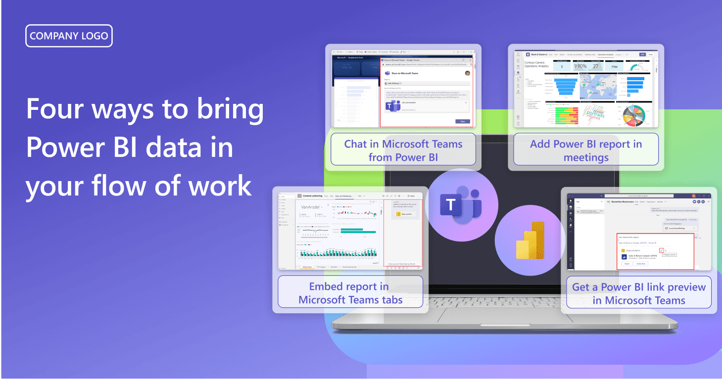
Focus: Hybrid work enablement campaigns, especially in collaboration with resellers and implementation partners.
Design Decisions:
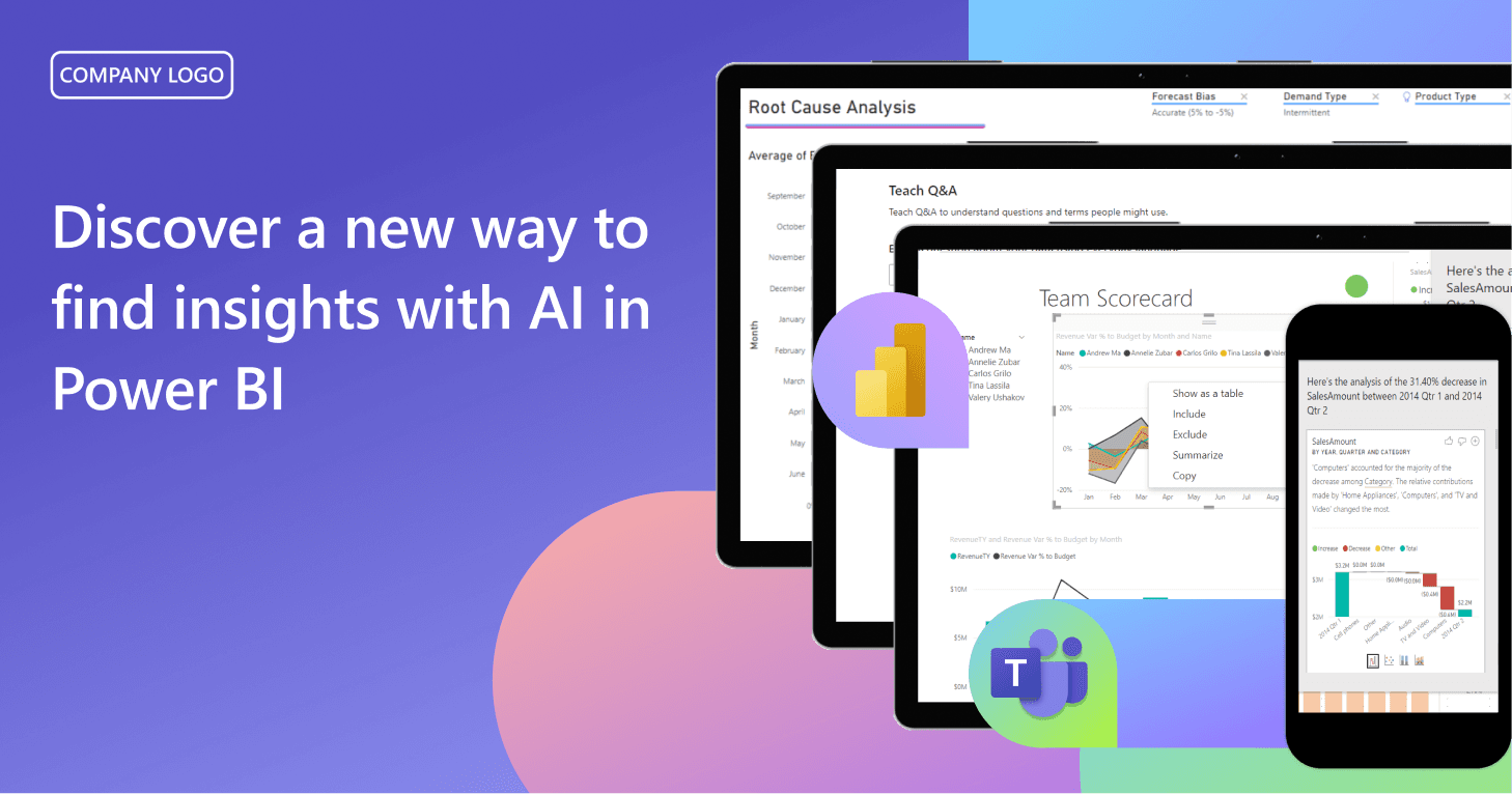
Used real product UI snippets from Microsoft Teams’ official image library to reinforce trust and recognition.
Ensured contrast and accessibility for diverse audiences by adhering to Microsoft’s color contrast guidelines (especially for mobile viewing).
Applied Microsoft's content hierarchy method—always leading with the benefit or problem-solving angle—then reinforcing it with supporting visuals.