
Redesigned Atticus Advantage Landing Page
Jul 26, 2025
Project Overview
Client: Atticus Advantage
Scope: Full redesign of the landing page
Role: UX/UI Designer
Timeline: 2 Weeks
Tools Used: Figma, Framer, Webflow (handoff ready), Loom (for client feedback loops)
🧩 Background
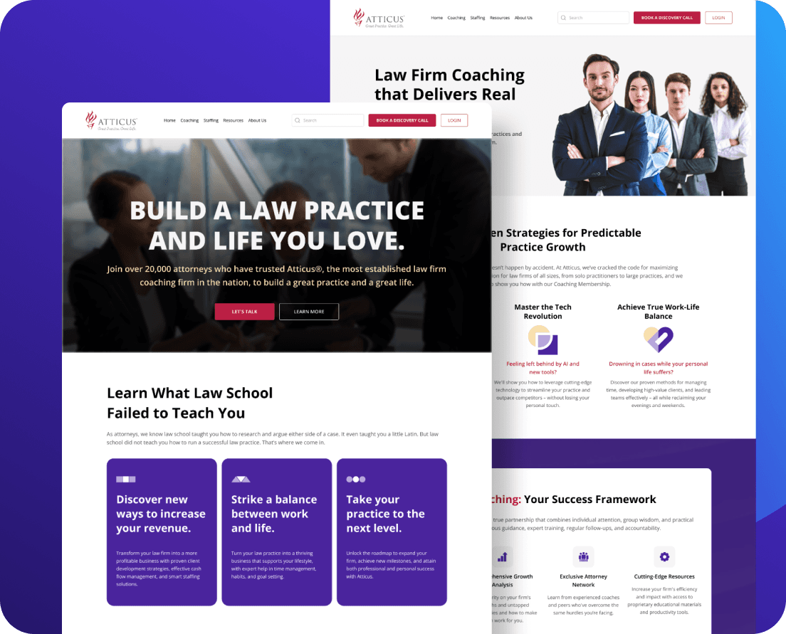
Atticus Advantage is a premium coaching program designed for lawyers transitioning into business ownership and leadership. Their goal is to empower legal professionals to take control of their time, team, and financial future.
Their old landing page felt outdated, text-heavy, and lacked a clear visual hierarchy. It failed to convey the premium, high-trust nature of the brand and was underperforming in lead conversions.
🎯 Goals
Increase trust & credibility with a more refined brand visual language.
Improve lead generation by optimizing the call-to-action flow.
Clarify messaging to appeal directly to overworked lawyers seeking control and growth.
Make it mobile-first, without compromising desktop elegance.
Elevate perceived value of the coaching programs.
🔍 Research & Insights
Stakeholder interviews revealed pain points around low conversion despite strong testimonials and a loyal client base.
Competitor analysis showed that many legal coaching services leaned too heavily on text, with poor UX and minimal emotional engagement.
User empathy mapping helped us see the deeper story: lawyers who feel burnt out, overwhelmed, and secretly crave transformation—not just tips.
🧠 Strategy
We reframed the landing page from being about Atticus to being about the lawyer. This meant:
Leading with emotional resonance, not just benefits.
Focusing on a hero transformation arc ("From burnout to business owner").
Structuring the flow using a StoryBrand-like narrative:
The problem
The guide (Atticus)
The plan
The success outcome
The call-to-action
🖌️ Design Execution
1. Visual Direction
Color Palette: Professional yet warm – deep navy, sage, and ivory for trust + calm.
Typography: Serif heading for authority + sans-serif body for clarity.
Imagery: Real lawyer-client photos, not stock, paired with texture-rich backgrounds for tactility.
2. Page Sections
Above-the-fold: Clear headline with pain-point + CTA. Scroll cue to invite interaction.
Proof & Credibility: Client testimonials, stats, media mentions.
Program Breakdown: Benefits-driven with iconography for scannability.
Transformation Stories: Before/after narratives with photos.
FAQs + Objection Handling: Preemptive clarity for hesitant visitors.
Primary CTA: “Book a Free Discovery Call” — repeated strategically throughout the page.
3. Microinteractions
Subtle animations triggered by scroll
Hover states on buttons to increase tactile feedback
Form UX optimized for mobile with smart field labels
📈 Results (Post-launch Observations)
Note: These metrics were collected 3 weeks post-launch
42% increase in call bookings
Bounce rate dropped by 18%
Visitors stayed ~35 seconds longer on page
Mobile conversion rate went up by 27%
💡 Key Learnings
Empathy wins: Speaking to the lawyer's burnout before offering solutions increased engagement dramatically.
Less is more: Trimming down the copy and structuring it visually made complex content feel digestible.
Real faces > generic graphics: Showing real lawyers created instant relatability and trust.
🔚 Final Thoughts
Redesigning the Atticus Advantage landing page wasn’t just about better design—it was about better storytelling. By shifting focus from the brand to the user's transformation, we created an experience that felt personal, high-touch, and trustworthy.
If the old page was a lecture, the new one is a conversation.
Let’s work
Whether you need a quick design fix or a full product UI from scratch—I’m up for it. Tell me a bit about your idea.